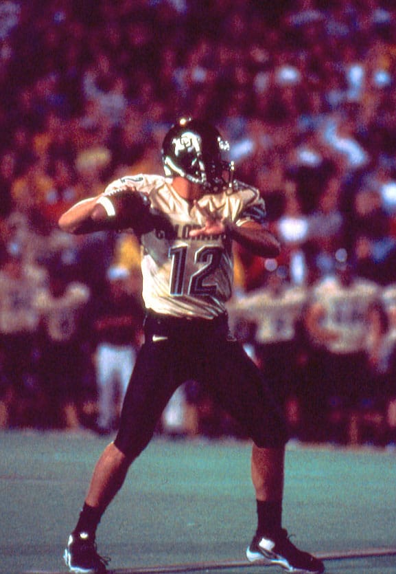
Uniform of the Day: Remember when Maryland was with Nike?
That's right, the Terps rocked with the Swoosh once upon a time.
Today's post is free for everyone to read! Click here to subscribe and unlock all of the content on 2StripesCPD!
Outside of Nike-Oregon, it's tough to think of a stronger brand-school connection in college football than Under Armour-Maryland. When former Terps special teams captain Kevin Plank founded UA in 1996, he may not have planned to eventually outfit the program he played for, but the partnership seems destined in retrospect. Sure enough, it became reality in January 2004 when Maryland announced a five-year deal with the then-budding apparel company. It didn't take long for Plank to show just how committed he was to showcasing his alma mater on a national stage:
Commercials like "Protect this House," and "Click Clack," were certified classics, and Maryland's presence in them helped the Terps stand out just as much as their new uniforms did:
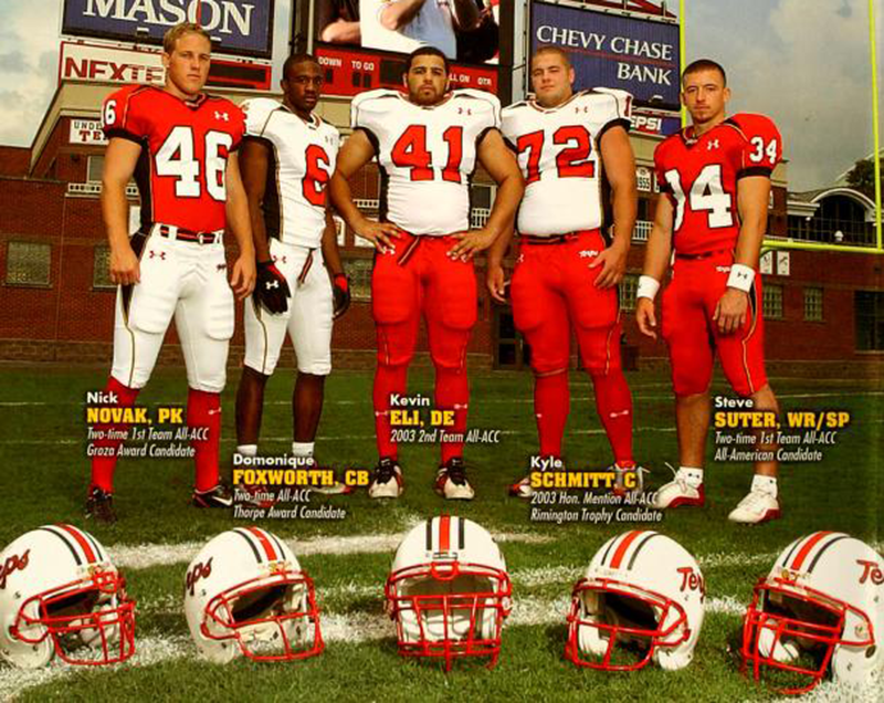
While things have gotten much better recently, the partnership has given us some of the wildest and most aggressive (to put it mildly) uniforms in college football:
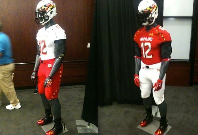
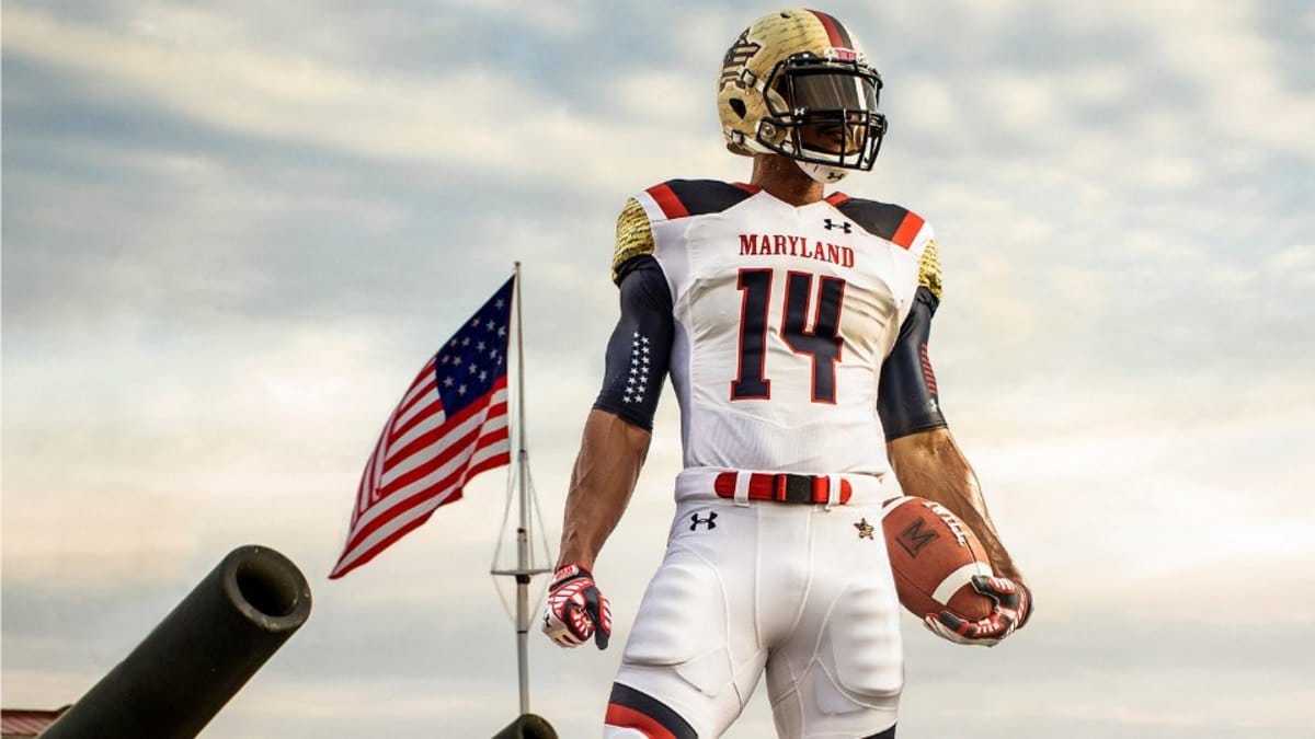
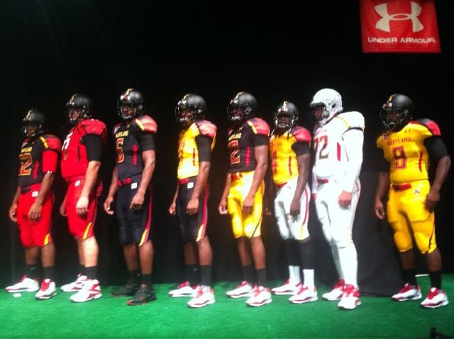
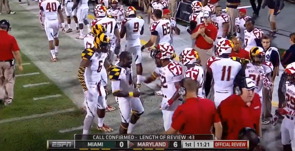
Via Maryland Athletics and Testudo Times
No matter what you think of Maryland's uniforms the past twenty years, their unique relationship with Under Armour has provided them a level of credibility you wouldn't expect from a program with a 110-131 record in that span to have. (No shade, Maryland fans.) That's why you'd be hard-pressed for any non-Terps fan to remember that they once rocked with Nike.
That's right! The swoosh adorned Maryland's threads from 1996-2003, highlighted by these simple –yet beautiful– looks from 1997-2001:
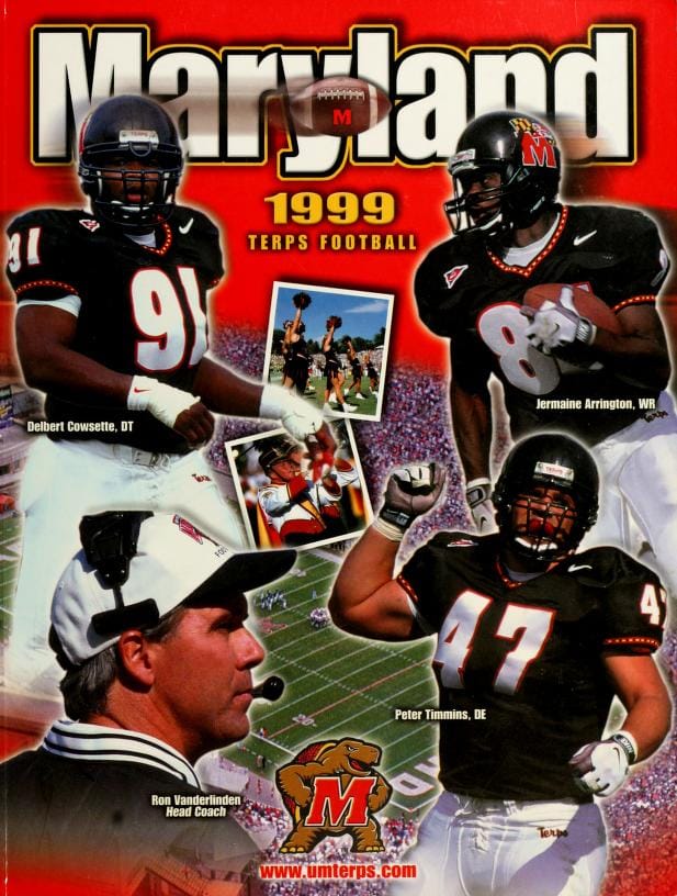
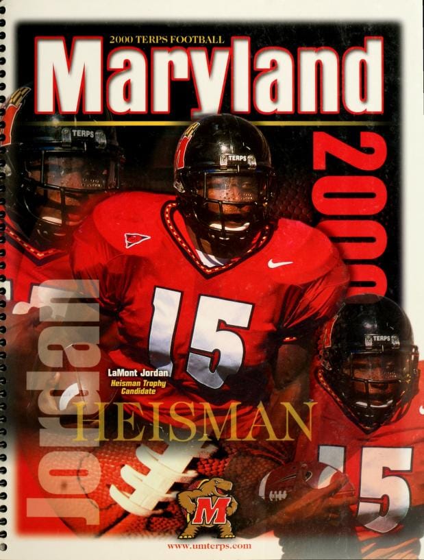
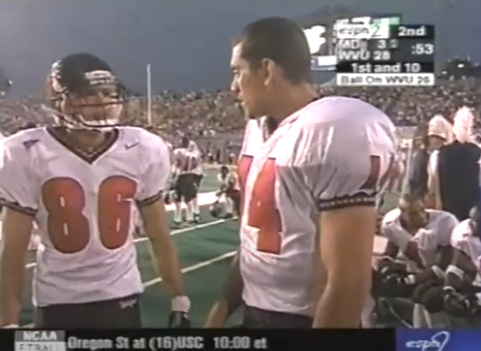
Via Maryland Athletics
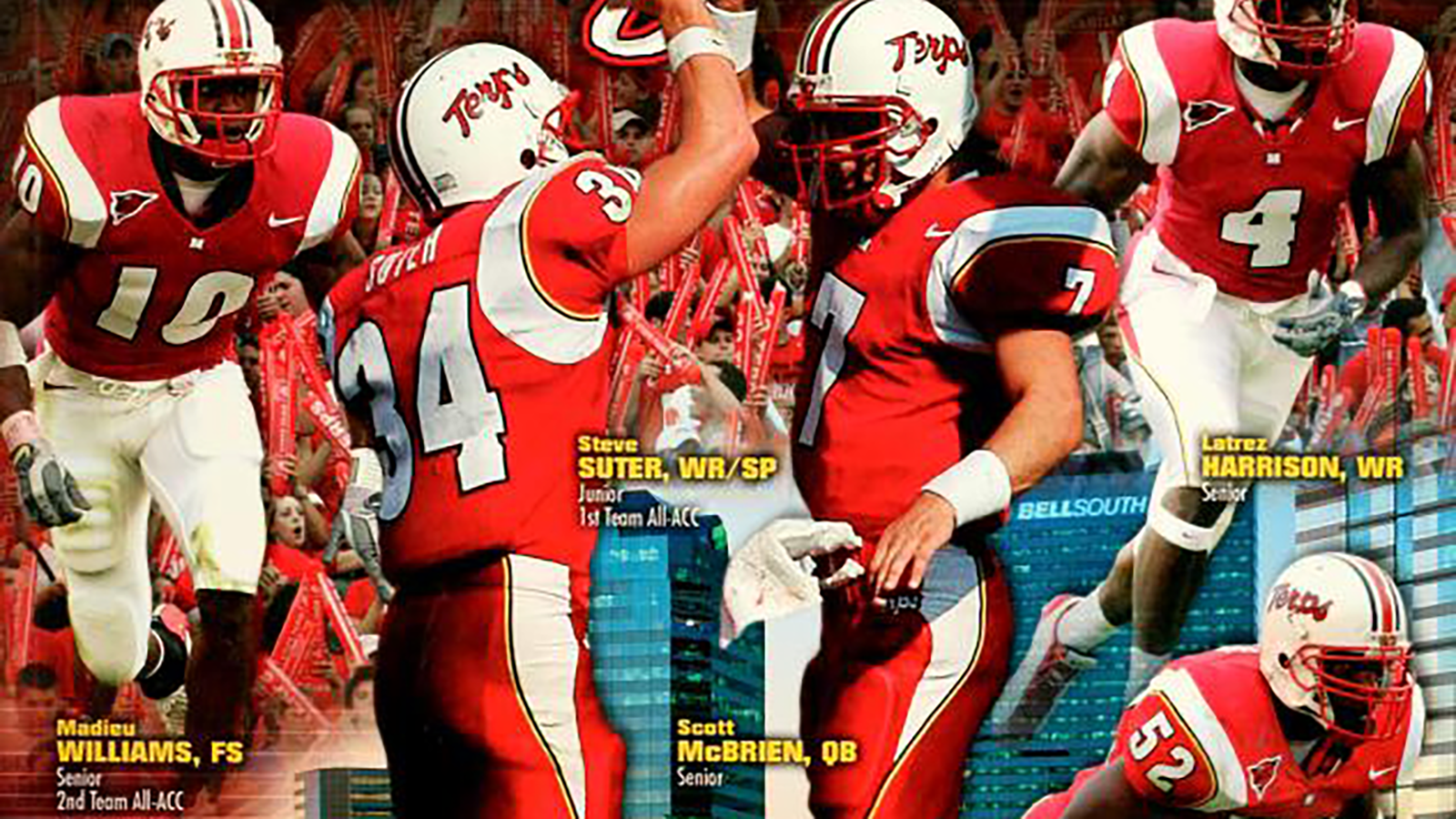
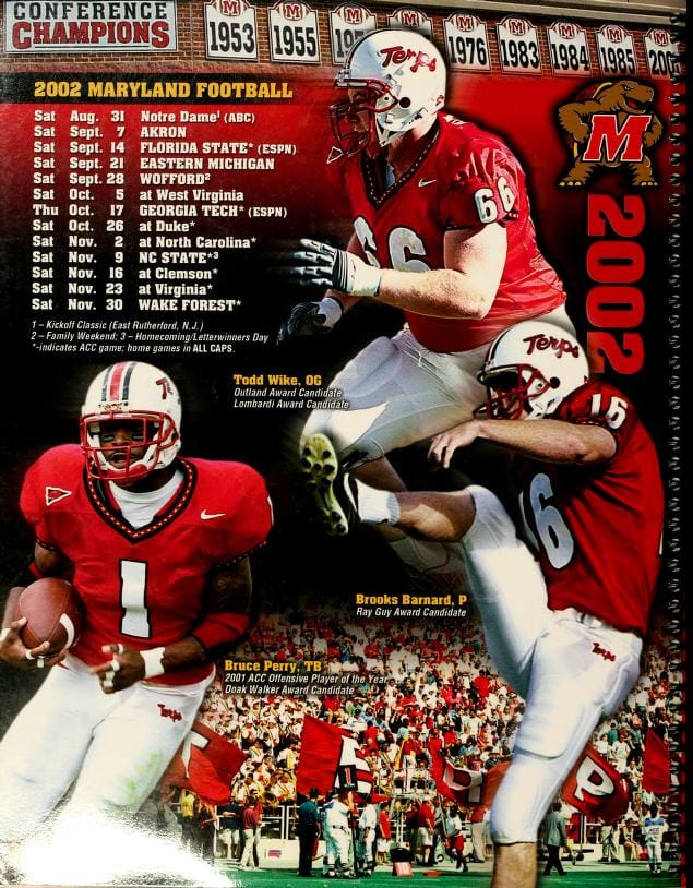
But in 2002, it was almost like Nike was intent on setting the stage for Under Armour to eventually take Maryland Football to uncharted uniform design territory when they unveiled this set:
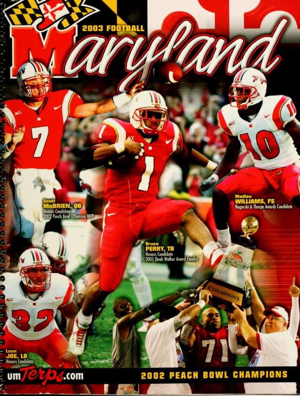
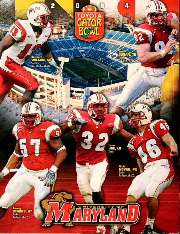
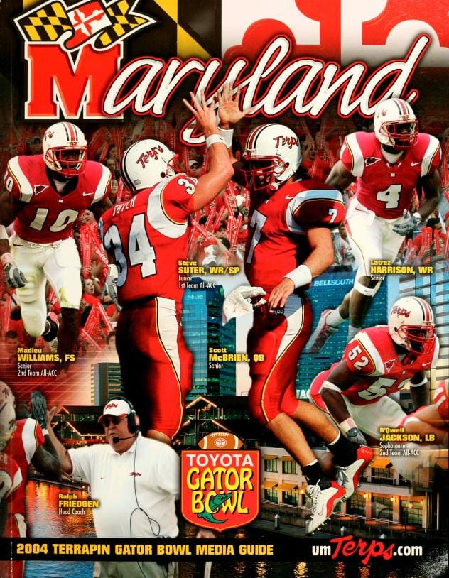
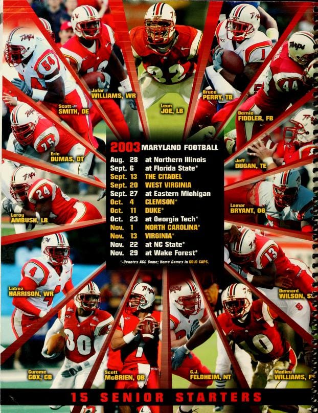
Via Maryland Athletics
These were a clear downgrade from their original Nike uniforms, highlighted by the weird decision to almost completely eliminate black from everything but the helmet stripes and jersey/pants piping. But you know what? I still love them. There's something about that number font that's always screamed, "MARYLAND!" to me. The thick wrap-around shoulder stripes complemented by the yellow/black piping works, and I'll never complain about a script "TERPS" helmet. I could do without the wavy pants stripe, but hey, it was the early-2000s ¯\_(ツ)_/¯. This was a distinctive look, and I'll always give teams credit for creativity that doesn't involve gradient or chrome.
Maryland's switch to Under Armour in 2004 meant this set only lasted two seasons, at least in College Park. UConn took the template over in 2004, before switching to their legendary Aeropostale fit. It seems unlikely that it'll ever come back, but crazier things have happened with it comes to uniforms. Who knows? We may even see Maryland's seemingly ironclad partnership with UA come to an end this year.

